Sometimes the best branding is clean, confident, and completely unbothered by trends.
Overview
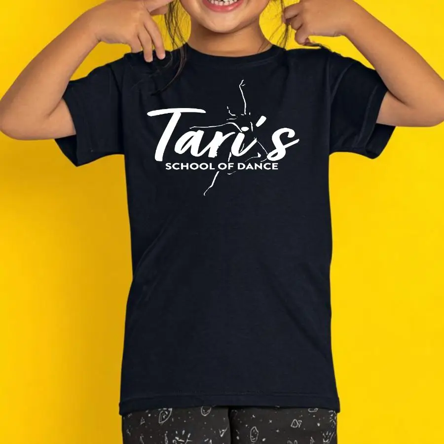
This design was printed in crisp white ink on a black youth tee, proving that simple doesn't mean boring. The studio name "Tari's" takes center stage in a bold, energetic brush script font that feels both personal and dynamic—like an autograph from the studio itself. Below it, "SCHOOL OF DANCE" is set in clean, uppercase sans-serif lettering that grounds the design with professional confidence. A graceful dancer silhouette is integrated into the composition, leaping through the typography in a way that adds movement without cluttering the space. The entire design sits centered on the chest, creating a classic logo placement that works for everyday wear. The contrast between the flowing script and structured block letters gives the design personality while maintaining that timeless studio identity that never goes out of style.
Results
These became the go-to studio shirts for Tari's dancers—the kind they actually want to wear to class, rehearsals, and just out running errands. The clean design works for everyone from the tiny tots to the competitive team, and it gets the studio's name out there whenever kids wear it around town. Parents loved that it looked professional without being over the top, and dancers loved that it didn't scream "dance mom" when they wore it to school or the grocery store.
Tell us what to swap, and our team will send you a digital proof and quote ASAP!*
*Some of the artwork presented in our portfolio is our client’s actual logos. While you are free to use anything you see as inspiration, out of respect for that client we’d obviously revise any artwork and make it more individual to your specific group or event.