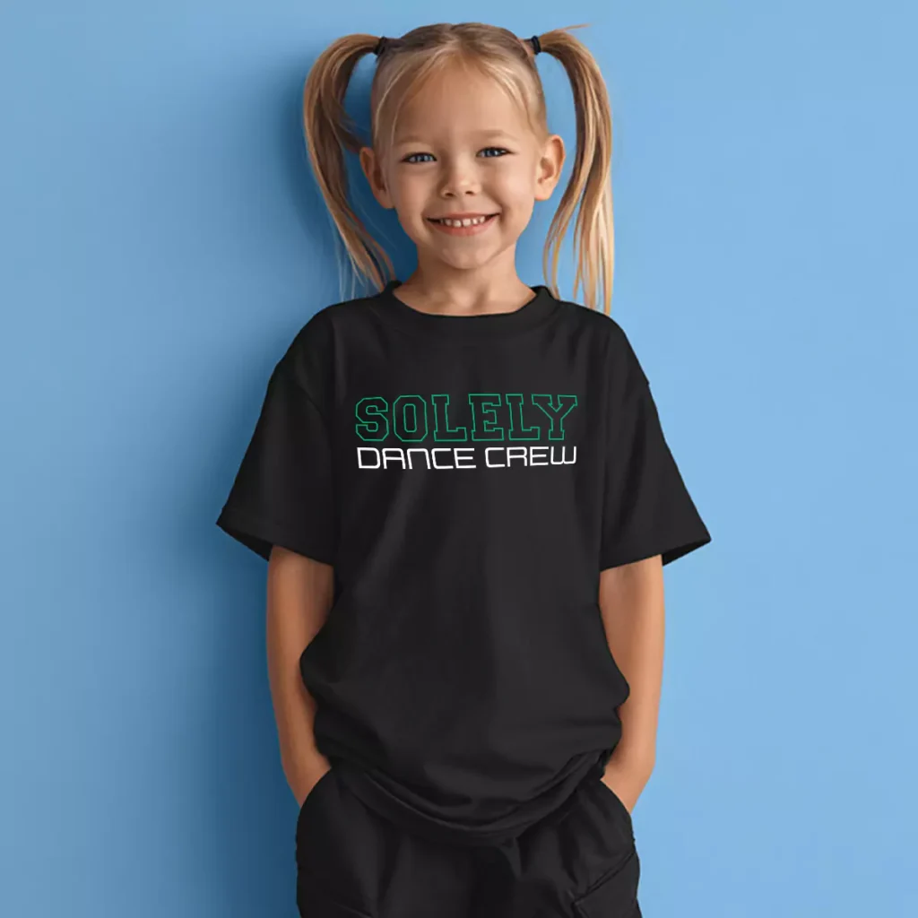
No fill, just outline. Solely Dance Crew went minimal with the color and ended up with one of the sharpest looks in the portfolio.
Overview
On a black youth tee, "SOLELY" sits across the upper chest in varsity block lettering rendered as a green outline only — no fill, just the letter edges glowing against the dark fabric like a neon sign. "DANCE CREW" runs below in solid white in a clean, slightly futuristic sans serif that grounds the outlined letters with some contrast. The two-line stack is centered and simple, letting the outline treatment do all the visual work. Front center placement keeps the hierarchy clean and readable from a distance.
Results
Outline-only lettering is having a moment in apparel design right now and this execution shows exactly why — it looks lighter and more considered than a standard filled block letter while still reading as bold and confident. For a dance studio shirt worn by younger kids, the neon green outline on black hits that sweet spot between cool and age-appropriate. It is a look that holds up well across every context they wear it in.
Dance Studio ShirtsDance TshirtsDance Recital ShirtsCustom Dance ApparelSolely Dance CrewUNITEE
Tell us what to swap, and our team will send you a digital proof and quote ASAP!*
*Some of the artwork presented in our portfolio is our client’s actual logos. While you are free to use anything you see as inspiration, out of respect for that client we’d obviously revise any artwork and make it more individual to your specific group or event.