A studio brand should feel like a lifestyle, not just a logo on a shirt.
Overview
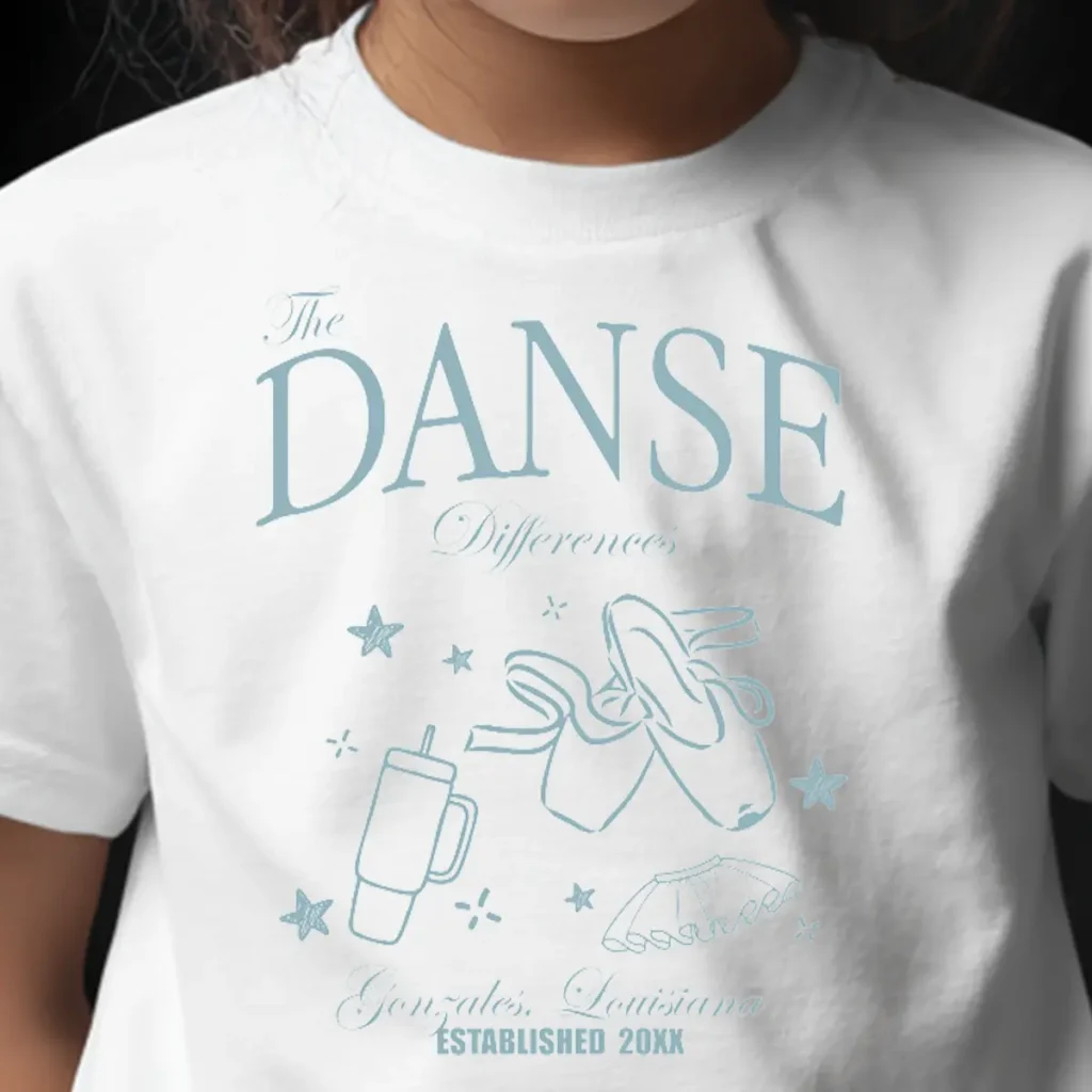
This design was printed in soft dusty blue on a clean white tee, creating a relaxed, lifestyle brand aesthetic. The phrase "The DANSE Difference" takes center stage, with "The" and "Difference" in elegant script while "DANSE" dominates in large serif letters that command attention. Below, playful hand-drawn illustrations capture the studio vibe—ballet shoes with ribbons flowing, a to-go coffee cup, and dancing figures, all surrounded by little stars and sparkles. The casual sketch style gives it that authentic, approachable feel rather than overly polished corporate branding. At the bottom, "Gonzales, Louisiana" and "ESTABLISHED 20XX" ground the design with location pride and longevity. The entire composition has a breezy, coffee-shop-meets-boutique quality that makes it feel less like dancewear and more like something you'd grab at a trendy local shop. The single-color approach keeps it simple and wearable while the mix of fonts and illustrations adds personality.
Results
These shirts gave the studio a lifestyle-brand approach to their identity, creating something dancers would actually choose to wear outside of class. The casual, trendy aesthetic helped position the studio as more than just a place to take lessons—it became part of the dancers' everyday style.
Tell us what to swap, and our team will send you a digital proof and quote ASAP!*
*Some of the artwork presented in our portfolio is our client’s actual logos. While you are free to use anything you see as inspiration, out of respect for that client we’d obviously revise any artwork and make it more individual to your specific group or event.