Elevate: The Motion Tee
A shirt that looks like it's still moving. That's exactly the energy Elevate was going for, and that's exactly what they got.
Overview
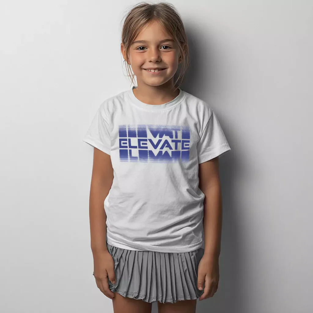
On a clean white tee, "ELEVATE" is set in a bold geometric font with the letters stacked into a rectangular block. The real trick is the motion blur treatment — horizontal streaks of blue fade in and out above and below the text, making the whole graphic feel like it's caught mid-movement. The blue tones shift slightly within the design, adding depth without adding complexity. Front center placement puts it right in the middle of the chest where the energy lands hardest.
Results
Dance tshirts that actually feel like they belong in a dance studio are rarer than you'd think, and the motion blur concept here does that job well. It connects the name of the studio to the idea of movement without needing an illustration or a figure to spell it out. Clean, current, and easy to wear — which is the goal every time.
Dance Studio Shirts
Dance Tshirts
Dance Recital Shirts
Custom Dance Apparel
Elevate Dance
UNITEE